
Dutpınar: a new web interface bringing four sectors together
We created a new corporate web interface for Dutpınar that brings four business areas, three product groups and a multilingual presentation together, gathering the brand story, product browsing and contact steps into one structure.
Client
Dutpınar
Food, farming, fish farming and construction
Scope
- Corporate web design
- Sector pages
- Product catalogue
- Multilingual interface
- Mobile interface
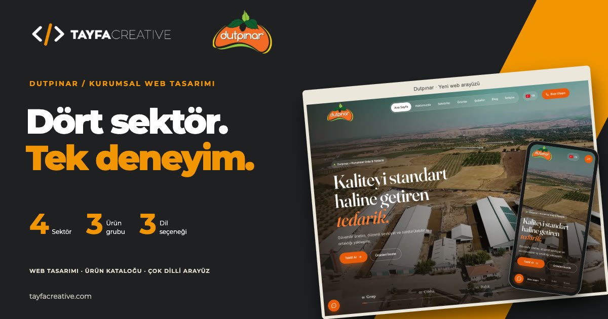
Interface scope
- 4
- Sectors in one structure
- 3
- Main product groups
- 3
- Languages
Challenge
Presenting Dutpınar’s activities across different sectors in one brand voice, and bringing corporate information, products, points of sale and contact options together in a clear web structure.
Strategy
- Handling farming, food, fish farming and construction together on the home page and sector detail pages.
- Presenting three product groups through catalogue and detail pages, keeping point-of-sale and corporate quote links visible.
- Combining the production story, Turkish/English/Chinese language options and mobile layouts in one interface approach.
Results
A new corporate web interface was created that presents four sectors, three product groups, the production story, branch information and contact options together, with Turkish, English and Chinese versions alongside.
01The need Telling different activities under one brand
Dutpınar’s activities span farming, food, fish farming and construction. The focus of the new web interface was to present this variety in one shared structure that visitors can follow easily.
We wanted a first-time visitor to see the big picture, and someone looking for a specific sector, product or point of sale to reach the relevant information. The corporate story and everyday needs were handled in the same design.
02Strategy Four sectors in one web experience
We designed the home page as a starting point into Dutpınar’s activities. Farming, food, fish farming and construction each appear with their own imagery and links, while every section reads as part of one corporate identity.
Sector details, the product catalogue, branches and contact pages were built around this structure, so visitors can move from the brand overview to the business area, product or contact option they are interested in.
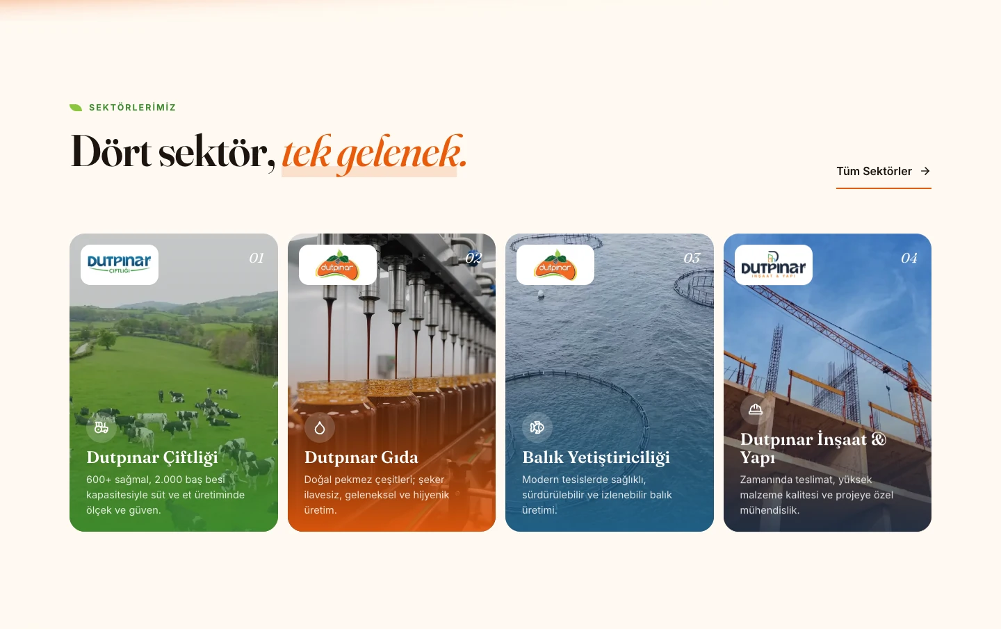
03Visual language Putting the production story first
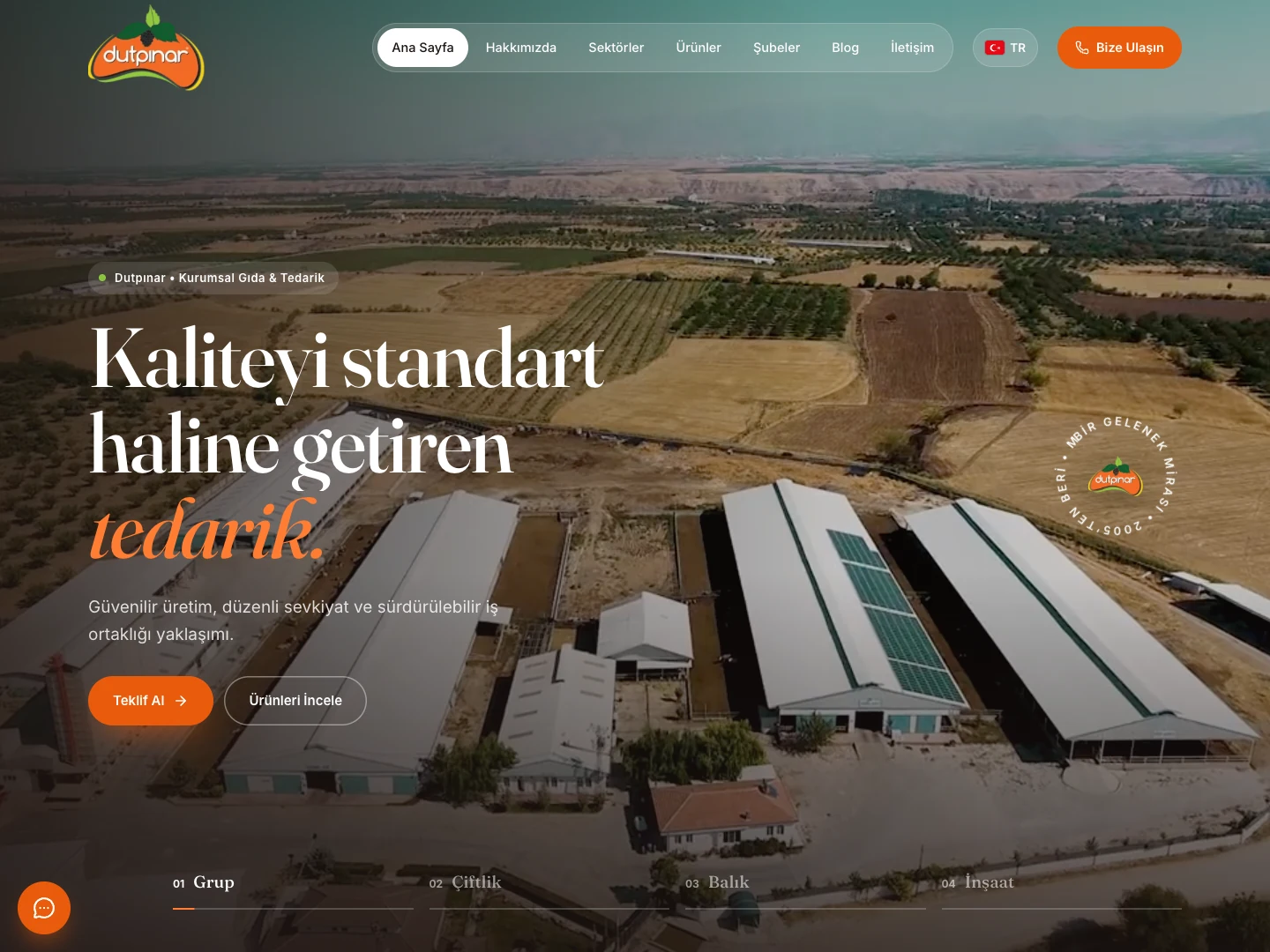
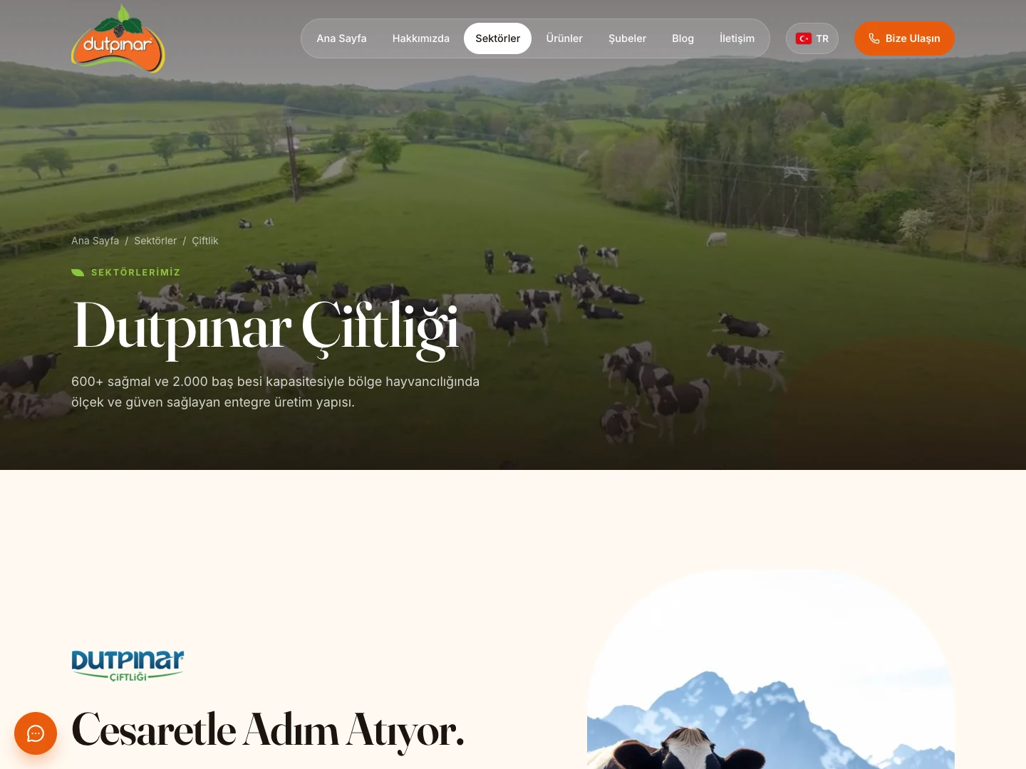
The new interface pairs wide imagery and a video hero with large headlines. Cream backgrounds, orange accents and green details, together with product and production imagery, make up the site’s visual language.
On the home page the corporate introduction, sector cards, product selection and brand history follow one another. The production section covers the farm, collection, processing and distribution stages, telling the story of the products and the production approach together.
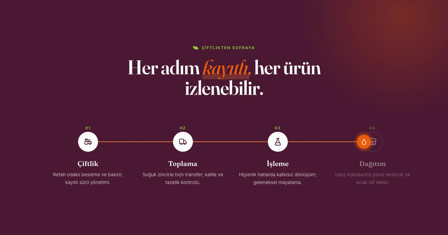
04Product catalogue From three groups to product detail
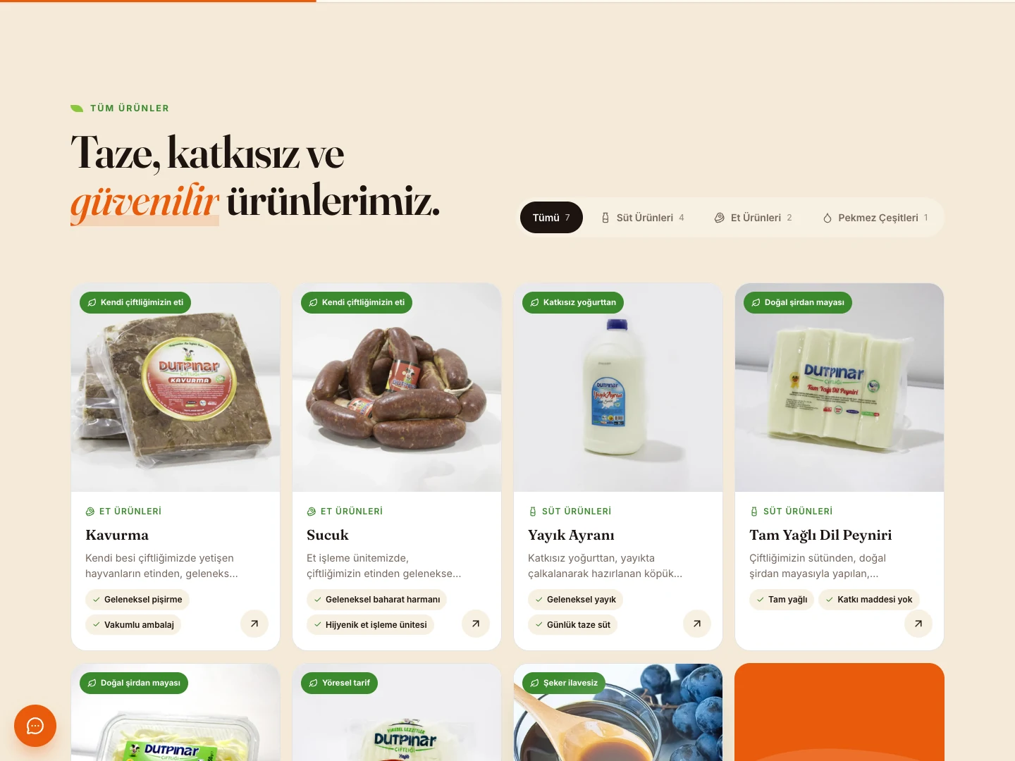
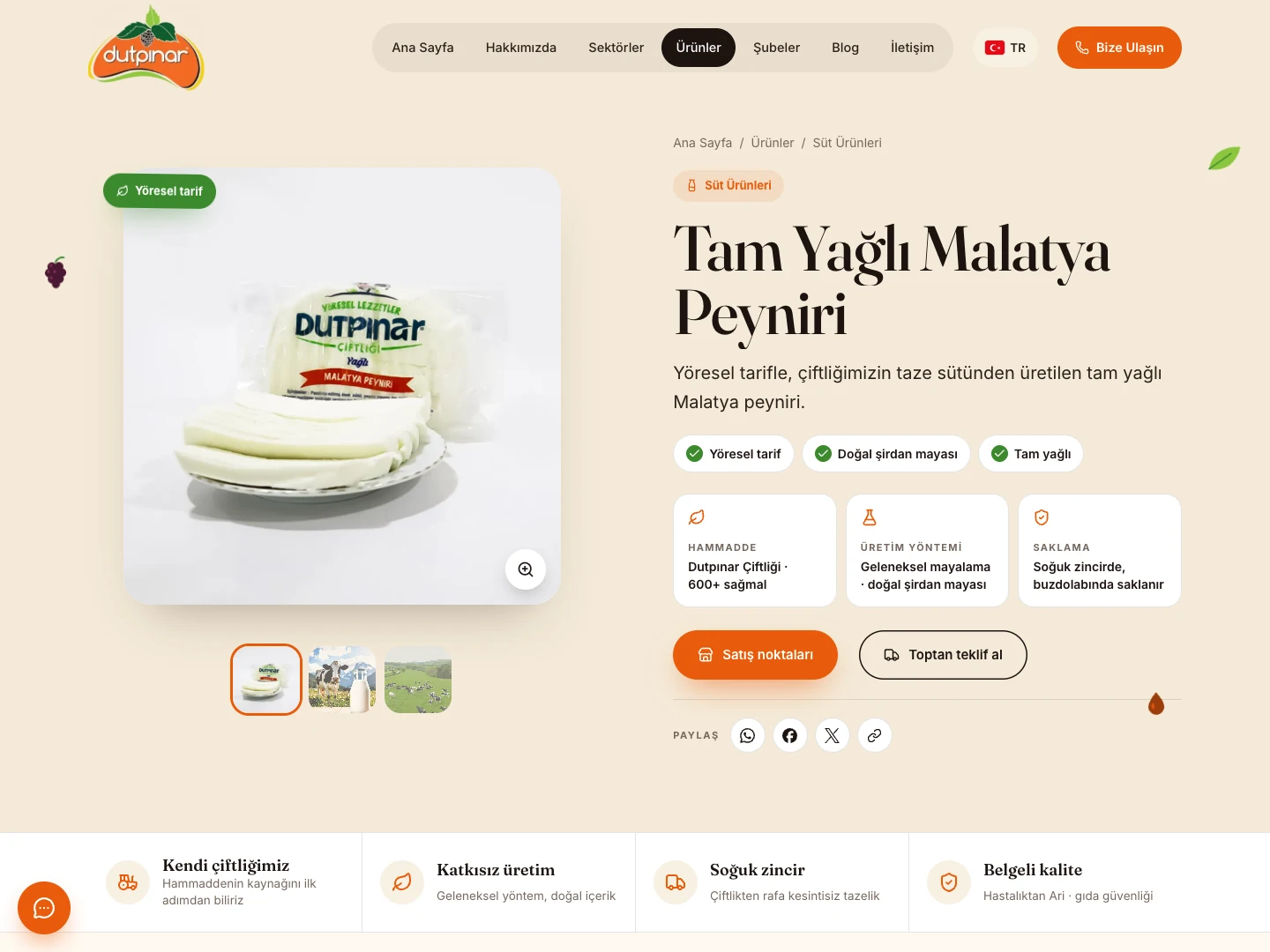
Products are presented in three main groups: dairy, meat products and pekmez (grape molasses). Category options in the catalogue help visitors browse the products they are interested in.
The product page brings the image, a short description and product features together. Information such as raw material, production method and storage supports the product story, and tabs for description, product information and serving suggestions present the details section by section.
Links to points of sale and wholesale quote requests connect browsing to the next step. We treated the catalogue as a reference for both visitors getting to know a product and businesses looking for corporate supply.
05Branches and contact Reaching the right touchpoint
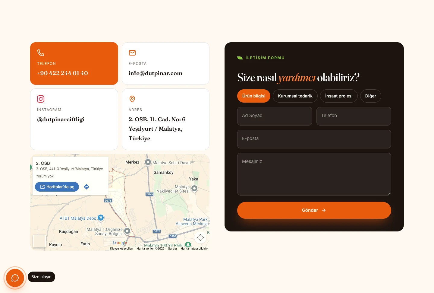
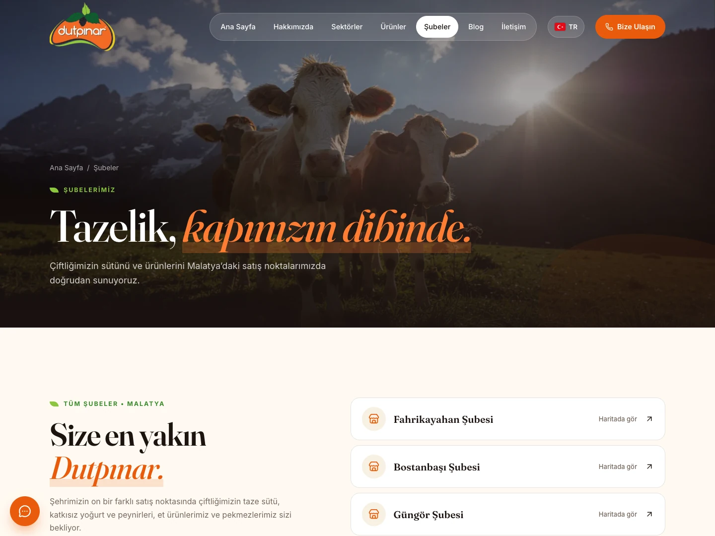
The branches page lists the points of sale with their names and map links. Linking to it from product pages connects product information with the physical point of sale.
The contact page combines phone, email and address details with a form. The form offers subjects for product information, corporate supply, construction projects and other requests, so visitors with different needs can choose the right channel.
06 Language options and mobile use
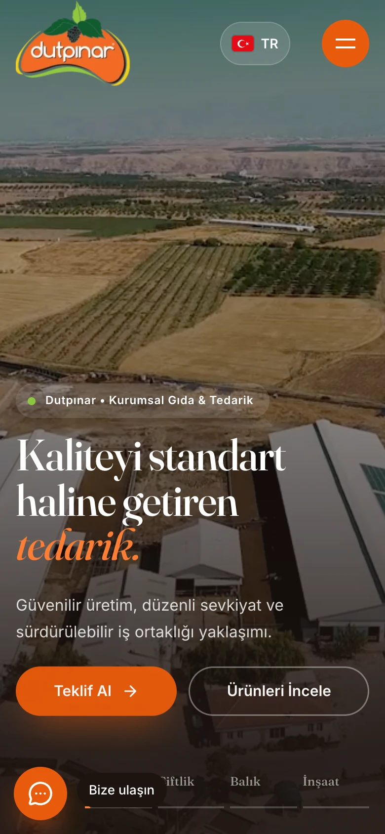
The interface offers Turkish, English and Chinese. The home page headlines, menu and corporate story are presented in the chosen language.
The visual story on desktop carries over to mobile screens, with the menu, hero and content layout adapting to screen size. Being able to follow product, sector and contact links on a phone is part of the new interface’s approach.
07Result A new interface uniting the brand’s many sides
For Dutpınar we created a new interface that presents four sectors and three product groups in one web structure, combining the corporate story, production story, product details, branch information and contact steps.
Supported by Turkish, English and Chinese versions, the work gathers getting to know the brand and finding the right information into one experience: a corporate showcase where visitors see Dutpınar as a whole and move on to the product or contact area they need.
From brand to product, desktop to mobile.
Real screens from Dutpınar’s new web interface. Open any image to see the details.
Services used in this project
Live project
newdemos.codeavm.xyzMore case studies
NDP Demirtaş Profil
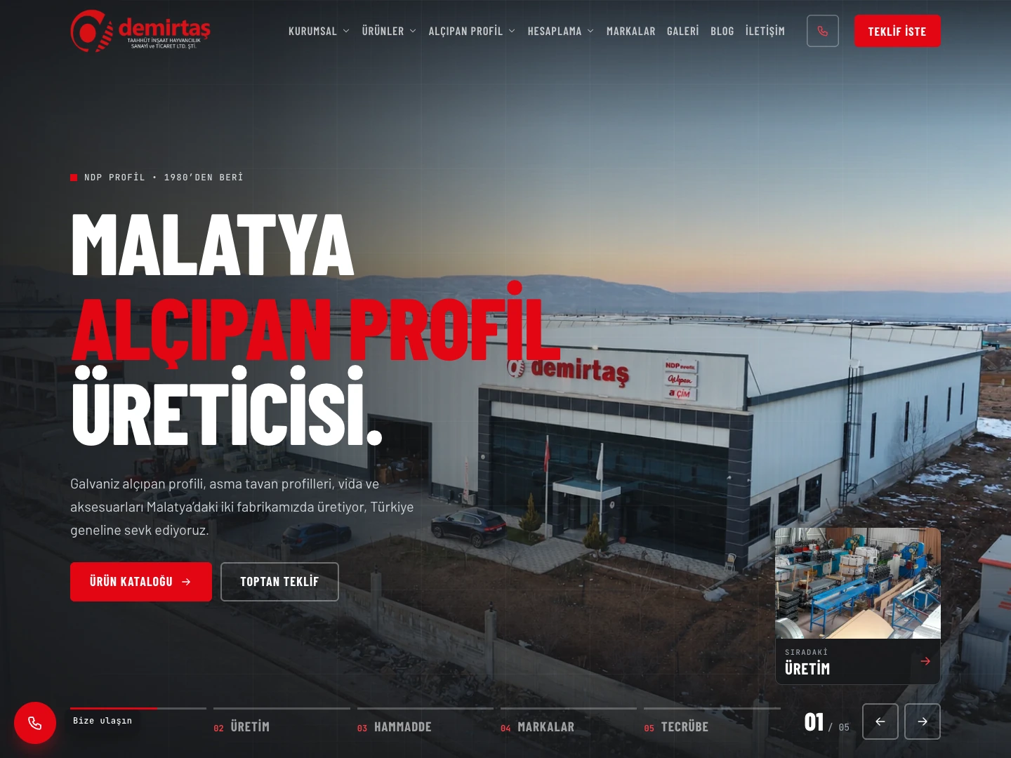
NDP Profil: a web experience that runs from product catalogue to quote request
We designed a website for NDP Profil that brings the corporate story, the product catalogue and material calculation tools together. Finding a product, reviewing its technical details and turning the need into a quote request are handled in one flow.
Read case study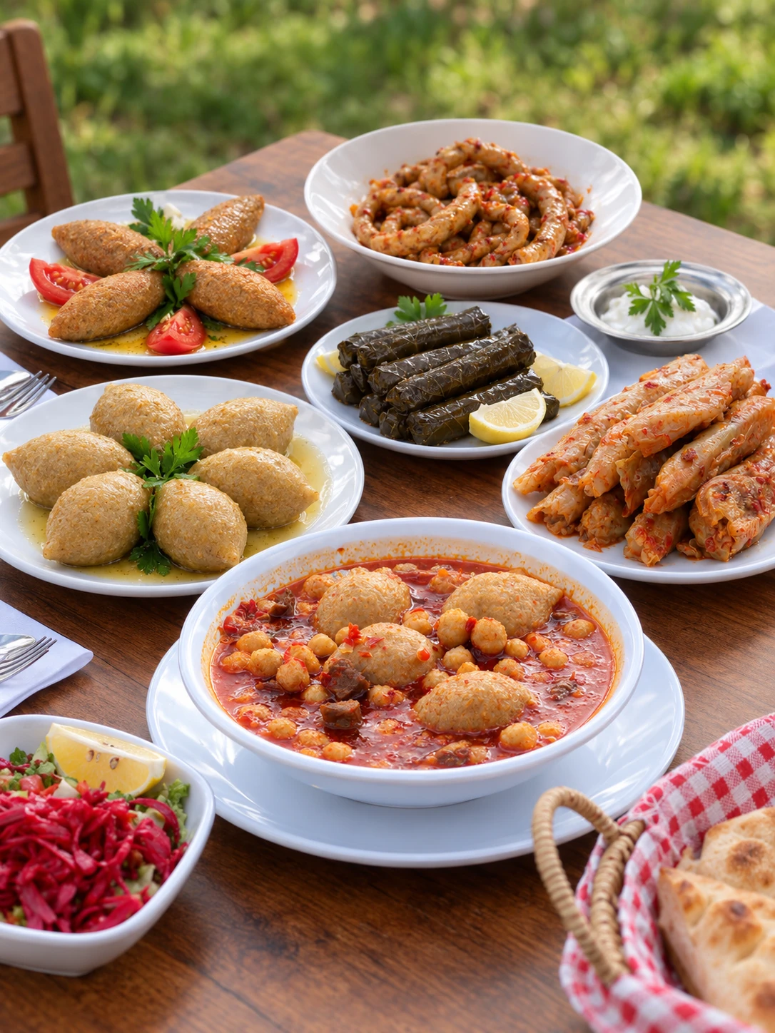
Turkuaz Döner
12 Instagram posts and 2 cinematic videos for Turkuaz Döner
We started managing Turkuaz Döner’s social media with a production set up in their own restaurant. We turned the product photos into 12 Instagram-ready post designs and completed the work with two cinematic videos.
Read case studyWhere is your website on Google?
We'll audit your site's technical health, speed and keyword rankings for free and send you a report.